threekit
I worked on Threekit’s enterprise 3D configuration platform, focusing on simplifying complex workflows while preserving the flexibility required by advanced users. The product supported powerful capabilities, but usability challenges created friction in onboarding and everyday use.
Partnering closely with product managers and engineers, I identified opportunities to improve clarity, hierarchy, and system consistency. Rather than redesigning individual screens, I focused on system-level improvements that scaled across the platform.
My work helped reduce cognitive load, improve task efficiency, and establish a more maintainable design foundation that supported future product growth.
Position
UI/UX Designer
Client
threekit
Year
2022
Projects
-
Re-Design community education portal
-
Adapt website to responsive design including updates to overall design

threekit
AI Visual Commerce for Leading Global Brands

My Role
My primary role was to create a responsive mobile version of the Threekit web-based 3D product configurator platform. This included updated UI elements and touch navigation which can be used on all mobile devices. In addition, I worked with the development team to hand off the final design for implementation.

RESPONSIVE
DESIGN
PLATFORM
Threekits web-based powerful 3D configurator used by top companies to showcase their products in AR or on the Web needed a mobile version so clients can edit catalog products with extensive attributes such as lighting, scene stages, and product information. As there was no native app for mobile devices a responsive version of the desktop application was needed as per client’s requests. Unlike typical
responsive designed websites, the threekit platforms’ powerful features were a challenge to incorporate into a responsive design as they utilize 3D software type editing tools in addition to extensive cataloging tools.
Responsive Design Layout Changes
Full desktop functionality was the primary focus for the mobile version of the configurator platform. The recent desktop UI navigational additions which included a re-design of the easy-to-access main sidebar menu system anchored to the left of
the screen were utilized for the responsive design. This menu was moved to the top of the screen and accessible easily with touch devices. In addition to the main navigation forms, icons and fonts were updated to fit the mobile layout and the
important key catalog function was retained for the clients to be able to navigate and use with ease. A 3D editing
component was cut due to the complexity of the feature utilizing 3D models, cameras, and lighting.

The Challenge + Process
-
Create a mobile user friendly and responsive design of the desktop threekit product
-
Retain key functionality from the Desktop version
-
Update navigation design for touch devices Compatibility with all mobile platforms
RESPONSIVE DESIGN RESULTS
The responsive design update of the Threekit configurator platform met all the criteria for usability clients were looking for, importantly the catalog features with future updates focusing on incorporating the 3D tools and long-term a native mobile application.


COMMUNITY EDUCATION PORTAL RE-DESIGN
The Threekit configurator platform community and educational website used extensively by new and existing users and clients was outdated and needed a focused update. Navigation and overall user experience had to be easier to access all the information, glossary, and community forums. Additionally, the self-led training and onboarding process was to be overhauled for easy step-by-step to get the user up and running on the platform.
My Role
My primary role was to create a responsive mobile version of the Threekit web-based 3D product configurator platform. This included updated UI elements and touch navigation which can be used on all mobile devices. In addition, I worked with the development team to hand off the final design for implementation.

The Challenge + Process
-
Create a newly re-designed and easy-to-use Education and Training Portal
-
Re-Design the Community site for an easier and more user-friendly user experience
-
Organize large amounts of training videos, articles, blogs, and education/training assets so they are easily accessible
-
Promote user training, videos, and material through various channels
-
Market webinars, classes, and various training documentation
User Experience + Visual Re-Design Highlights Landing Page 1
Focused highlights of the landing page with updated key components and features in addition to navigation and overall user experience updates.
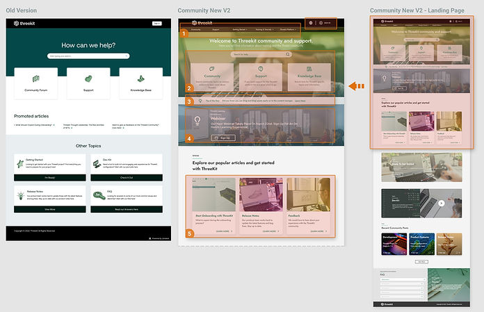
Landing Page focused updates
-
Add top-level navigation for easy one-click access to areas of the website
-
Update quick links to key education centers on the community portal
-
Add quick tips to showcase key features of the configurator platform
-
Promote online learning for clients through webinars with rotating banners of classes, documentation, and training
-
Easy access to key features of the education portal such as onboarding, product release notes
User Experience + Visual Re-Design Highlights Landing Page 2
Continuation of focused highlights of the landing page with updated key components and features in addition to navigation and overall user experience updates.
Landing Page focused updates
-
Quick start to the self-led training link accessible based on importance from the landing page
-
Developer-Kit information key features
-
Community-related posts based on recent activity
-
FAQ of most common questions anchored to landing can continue to the full FAQ from here

COMMUNITY AND EDUCATION
TRAINING PORTAL RESULT
The Community Portal re-designed encompassed a full navigation user flow update. Access to areas of the site is fewer clicks away and important information is presented in the level of importance first. Promotional education through webinars and other channels is promoted and data such as tutorials are one click away and saves the user from searching the site through sub-menus.


