toursbylocals
Modernizing a global travel marketplace — from a fragmented, desktop-era experience into a mobile-first, system-driven platform that guides travelers from discovery to booking with confidence.
“Keeping travel human.”
ROLE
Senior UI/UX Designer
Year
2022 - 2025
Projects
-
Led end-to-end redesign of ToursByLocals public website, guide tools, internal operations portals, and checkout experience
-
Built and evolved a unified design system to improve consistency across web and mobile
-
Iterated on user experience through data, stakeholder input, and ongoing usability improvements

toursbylocals
Keeping travel human
My Role
My role at ToursByLocals was to lead the UI design for the evolution of the website and brand, with a strong focus on improving user engagement and conversion. I worked closely with product, engineering, and stakeholders to integrate design seamlessly into development, ran usability testing to inform decisions, and built and maintained a scalable design system to ensure consistency and speed across the platform.
Challenge
The toursbylocals platform had not seen a major update since 2015, resulting in an outdated experience across the main website, guide portal, and internal admin tools.
Problem:
The customer-facing site was difficult to navigate, with a fragmented booking funnel and a checkout flow that created friction and drop-off — particularly on mobile devices, where a growing percentage of users were researching and booking tours. The experience was not optimized for smaller screens or touch interactions.
At the same time, guides struggled with a complex and unintuitive portal for managing tours and communication, while internal teams relied on admin tools that were inefficient and hard to use.
Impact:
These issues negatively affected mobile and desktop conversion, slowed internal workflows, and made it harder for guides and staff to manage day-to-day operations effectively.
Opportunity:
This presented an opportunity to modernize the entire ecosystem and delivering a mobile-first booking experience, redesigning the end-to-end funnel and checkout flow, improving usability for guides and internal teams, and introducing new features that would support future growth, scalability, and engagement across the platform.

Design System
The updated design system established a unified, scalable foundation across the ToursByLocals platform. Built on Ant Design and integrated with React, it provided a structured baseline while being adapted to fit the specific needs of the marketplace, guide tools and the admin backend.
Typography and color were completely updated to align with the new and improved brand direction, while spacing, patterns, and modular components were standardized for clarity and consistency. The system was evolved beyond default Ant components, creating reusable, flexible building blocks that supported faster iteration across the main site, guide portal, and admin tools on both desktop and mobile.
Unified brand palette with accessible contrast and semantic states

Responsive type scale designed for clarity across devices

Standardized spacing and layout rules for predictable composition

Landing Page and Search Entry
The landing experience was redesigned to reduce friction at the very first interaction. The previous search entry felt disconnected from the hero content and asked users to “think” before they were ready.
The updated design brings search into the emotional moment of discovery — pairing inspirational imagery with a clear, confident search entry that feels approachable rather than transactional.
The focus was on clarity, hierarchy, and intent: making it immediately obvious what ToursByLocals offers, how to start, and why it feels different from a typical travel booking site.
Key improvements included simplifying the search UI, strengthening contrast and readability over imagery, and designing the component as part of the broader design system so it scales cleanly across desktop, mobile, and future entry points.
Landing Page
Original
![FireShot Capture 002 - ToursByLocals - Private Tours By Local Guides - [web.archive.org].p](https://static.wixstatic.com/media/0cf707_d91a710042694701bd3ce2ab1489cff9~mv2.png/v1/crop/x_63,y_0,w_1433,h_1675/fill/w_49,h_57,al_c,q_85,usm_0.66_1.00_0.01,blur_2,enc_avif,quality_auto/FireShot%20Capture%20002%20-%20ToursByLocals%20-%20Private%20Tours%20By%20Local%20Guides%20-%20%5Bweb_archive_org%5D_p.png)
Re-designed

Search results
Original
![FireShot Capture 006 - Tokyo Tours with Local Private Tour Guides - [web.archive.org].png](https://static.wixstatic.com/media/0cf707_4379435d7404493cbbc6f17ef0b225ae~mv2.png/v1/crop/x_0,y_6,w_1560,h_1418/fill/w_49,h_45,al_c,q_85,usm_0.66_1.00_0.01,blur_2,enc_auto/FireShot%20Capture%20006%20-%20Tokyo%20Tours%20with%20Local%20Private%20Tour%20Guides%20-%20%5Bweb_archive_org%5D.png)
Re-designed

Original
Re-designed
Landing page Key Design
Considerations
-
Search positioned as a primary entry point, not a secondary tool
-
Clear visual hierarchy between inspiration, messaging, and action
-
Reduced cognitive load (fewer choices, clearer defaults)
-
Designed mobile-first, then expanded for desktop
-
Built as a reusable system component, not a one-off hero hack
Search Entry Key Design
Hierarchy
-
Search entry visually leads the hero
-
Strong contrast and scale establish it as the primary action
Defaults & Guidance
-
Sensible defaults reduce decision friction
-
Clear placeholder text sets user expectations immediately
Clarity & Focus
-
Minimal inputs, no competing actions
-
Clear visual priority guides users toward their first action
-
Search feels approachable, not overwhelming
Desktop Search Entry

Search Entry Responsive Design
Designed around thumb-friendly interaction and a single clear focus, the search experience maintains visual hierarchy and priority across every breakpoint while staying lightweight and fast on mobile networks.

Search Results & Filters
The search results experience was refined to make tours easier to scan, compare, and narrow down quickly. Key details like guide, duration, price, and ratings are surfaced upfront to support fast, confident decisions.
Filters were moved into a streamlined modal to reduce visual clutter while still allowing powerful refinement. This keeps the results page focused and helps users move from browsing to booking with less friction
Search Results

Search Results Filters

Key Design Considerations
-
Problem
The previous search results were visually dense and made it difficult for travellers to quickly compare tours or refine results without feeling overwhelmed, especially on content-heavy destinations. -
Solution
We redesigned the results into a clear, card-based layout and moved filtering into a focused modal. This surfaced essential decision-making information first while keeping advanced filtering accessible but out of the way. -
Outcome
Travellers can scan results faster, refine with confidence, and stay in flow—reducing decision fatigue and creating a smoother path toward checkout.
Landing Page
Original
Re-designed
Search results
Original
![FireShot Capture 006 - Tokyo Tours with Local Private Tour Guides - [web.archive.org].png](https://static.wixstatic.com/media/0cf707_4379435d7404493cbbc6f17ef0b225ae~mv2.png/v1/crop/x_0,y_0,w_1560,h_1823/fill/w_49,h_57,al_c,q_85,usm_0.66_1.00_0.01,blur_2,enc_avif,quality_auto/FireShot%20Capture%20006%20-%20Tokyo%20Tours%20with%20Local%20Private%20Tour%20Guides%20-%20%5Bweb_archive_org%5D.png)
Re-designed
Tour and Guide Details
The detail pages were designed to build trust while clearly communicating the experience. Essential tour information — duration, pricing, inclusions, activity level, and reviews — is surfaced alongside guide credibility markers such as ratings, response time, and local expertise. Together, they balance inspiration with clarity, helping travelers feel confident and ready to book.
Tour Details

Guide Details

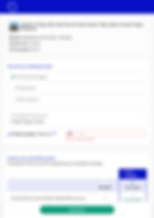
Checkout Experience
The checkout page is the most critical step in the ToursByLocals booking funnel. After guiding travelers through discovery, comparison, and tour details, this is where intent turns into conversion. Every design decision here directly impacts completion rates and revenue.
The goal was clarity, reassurance, and momentum. Key booking details (date, guide, location, group size) are surfaced upfront to reduce uncertainty. Pricing is clearly broken down with no hidden costs, reinforcing trust. Required inputs are minimal and structured to prevent friction, while cancellation coverage is presented in a way that informs without overwhelming.
User testing played a major role in refining this flow. We observed hesitation around price breakdowns, cancellation language, and payment expectations. Based on feedback, we simplified layout hierarchy, clarified messaging, tightened copy, and improved visual grouping between booking details and payment actions.
The checkout was also designed as part of a scalable system. As new features were introduced — updated payment processors, messaging tools, promo logic, and mobile enhancements — the structure allowed for iterative improvements without breaking the flow.
This page continues to evolve through ongoing testing and optimization, ensuring the final step in the journey feels seamless, secure, and confidence-inspiring.

Booking/Checkout focused updates
-
Simplified & Focused
-
Problem
The previous checkout felt cluttered and distracting, pulling attention away from completing the booking. -
Solution
Reduced visual noise, tightened hierarchy, and centered the experience around one primary action. -
Outcome
A clearer, more controlled path to conversion.
2. Unclear Pricing & Trust Friction
-
Problem
Hesitation around service fees and totals. -
Solution
Introduced a transparent pricing module with clear cost separation, total emphasis, and promo code logic integrated directly into the summary. -
Outcome
Increased trust and reduced last-step hesitation..
3. Clear Cancellation Options
-
Problem
Dense policy language created cognitive overload. -
Solution
Simplified comparison with visual cues and a highlighted best option. -
Outcome
Faster decision-making and better upgrade visibility.
4. Reduced Form Friction
-
Problem
Unclear required fields and validation caused frustration. -
Solution
Streamlined inputs with improved inline feedback. -
Outcome
Reduced friction and improved completion flow.
Mobile-First Checkout
With a significant portion of bookings happening on mobile devices, the checkout experience was designed responsively from the ground up. The goal was to maintain clarity, reduce friction, and prioritize thumb-friendly interactions — ensuring travelers could complete their booking quickly and confidently on smaller screens.
Checkout Tablet
Checkout Mobile

Mobile Checkout Optimization
-
Stacked, Priority-Driven Layout
Reorganized the content into a clear vertical flow. Tour summary → pricing → inputs → CTA and eliminated side-by-side complexity from desktop. -
Persistent Primary CTA
“Checkout” kept highly visible and thumb-accessible to reduce scroll fatigue and abandonment. -
Condensed Pricing Module
Collapsible price breakdown with strong total emphasis to prevent visual overload on small screens. -
Touch-Optimized Inputs
Larger tap targets, simplified dropdowns, and improved numeric keypad triggers for phone and payment fields. -
Inline Validation & Error Handling
Immediate feedback to prevent submission errors and reduce frustration on slower mobile networks.